Black Ferns
Made with the goal-kicking (or try-scoring?) team at Re and our friends at New Zealand Rugby.
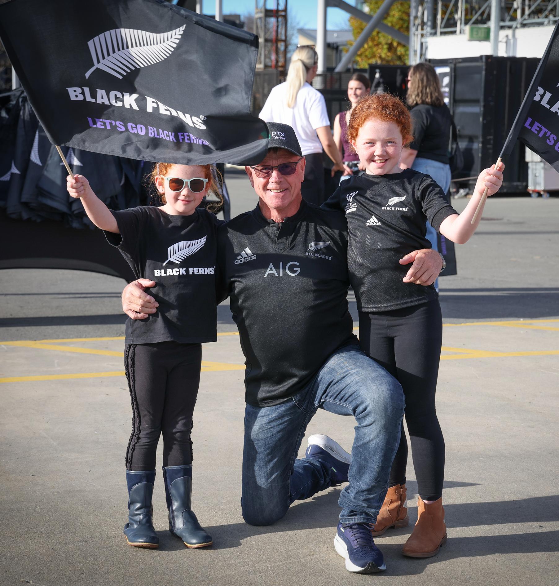
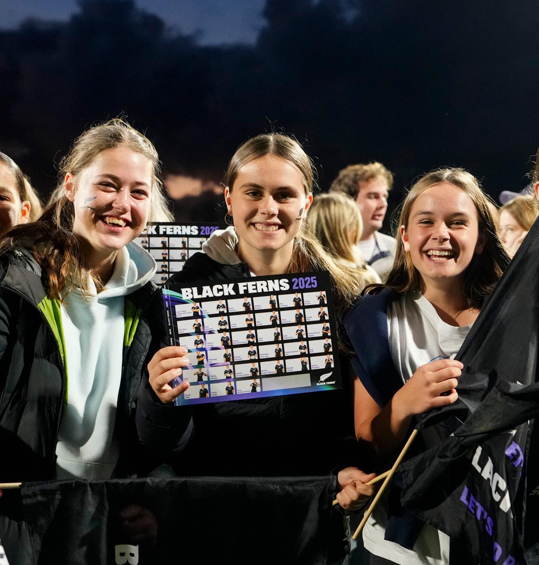
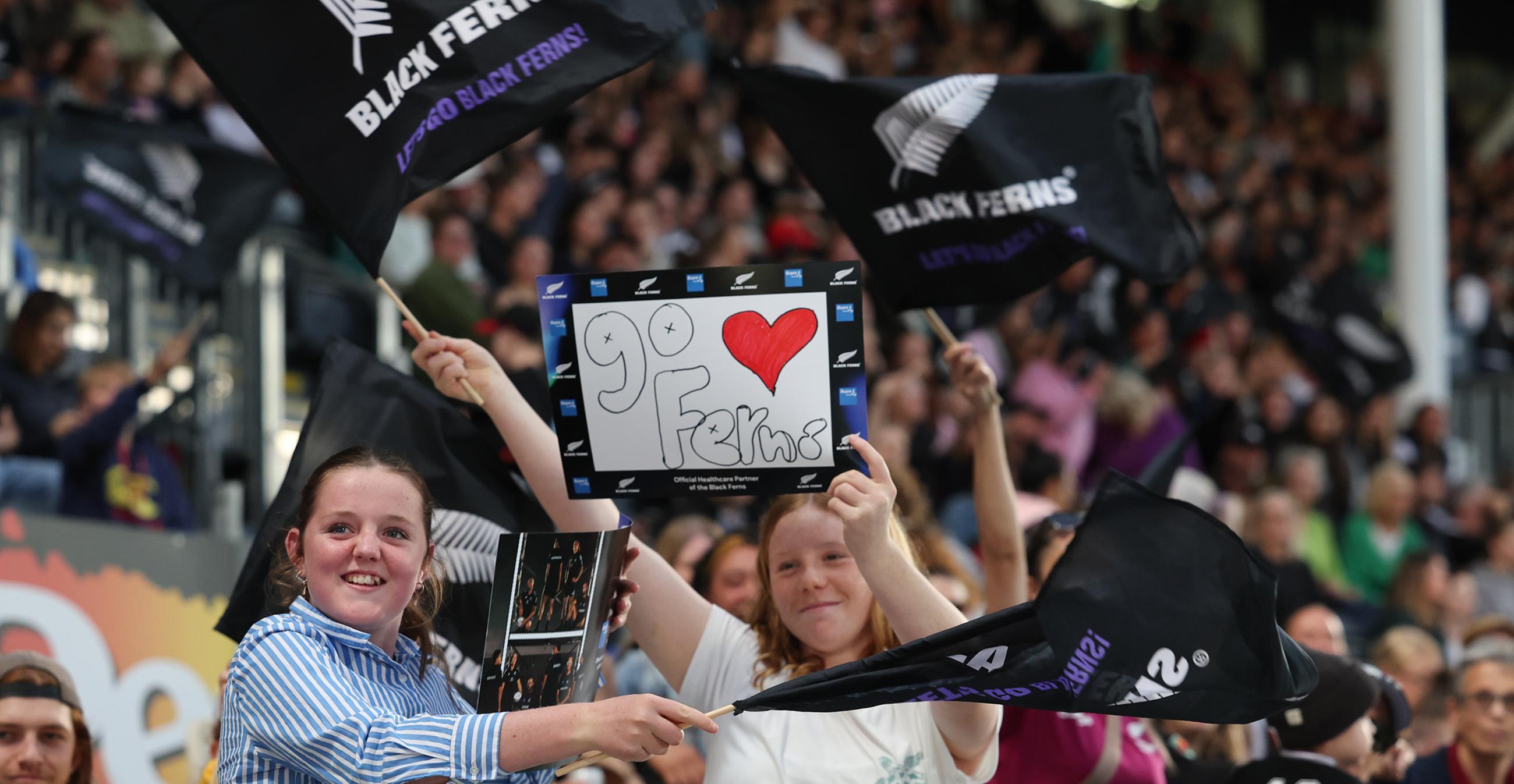
The All Blacks and The Black Ferns are two of the most iconic brands of the sporting world. They’ve got respect on and off the field, and the scoresheet to back it up. They command a legion of fans at home and are admired around the globe. But nothing in sport lasts forever.
How do we harness the astronomical growth in women’s rugby, and put both teams on equal footing? How do we capture the essence of both iconic teams as distinctive brands that can show up far beyond match day?
We do it by embracing the power of black.
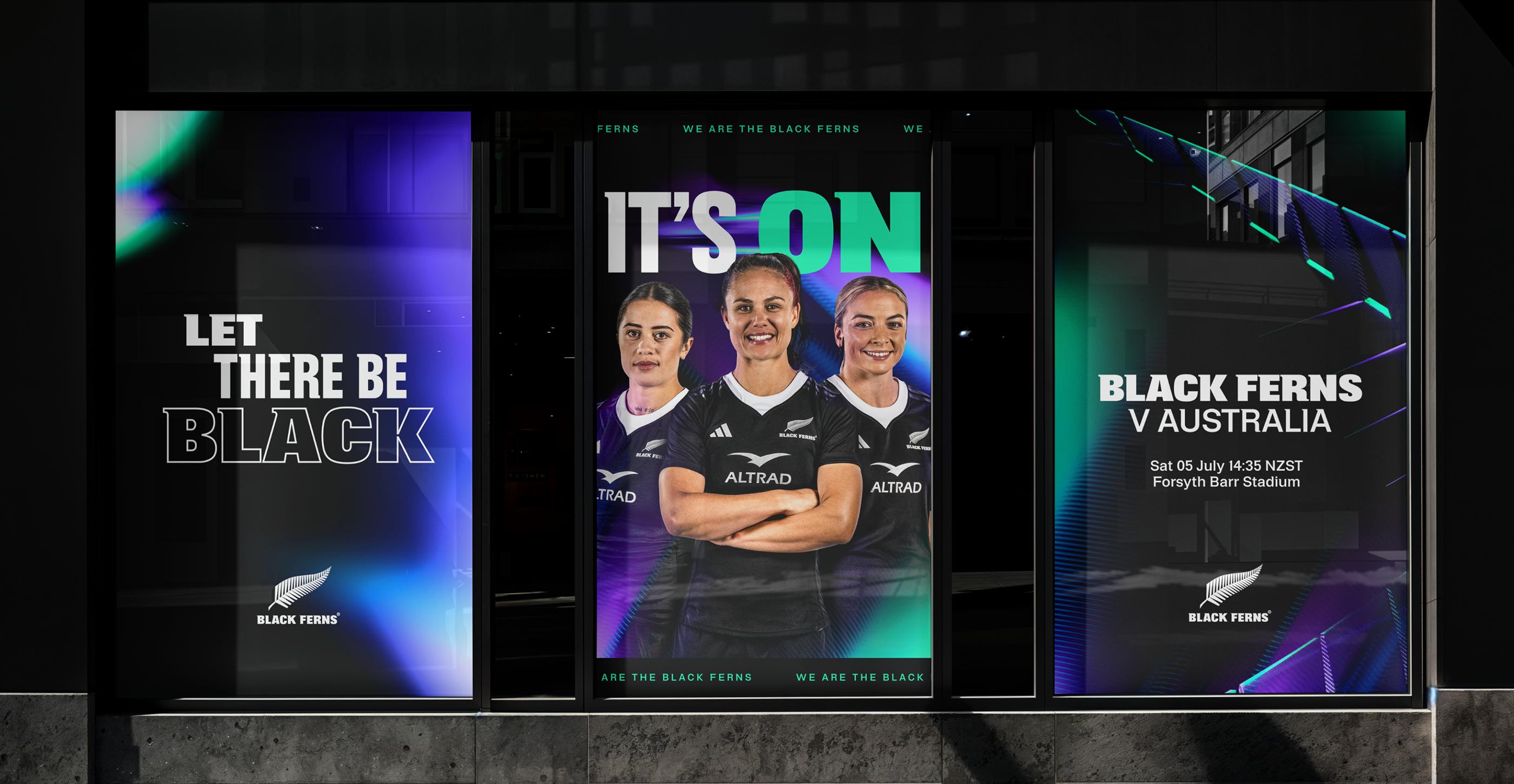
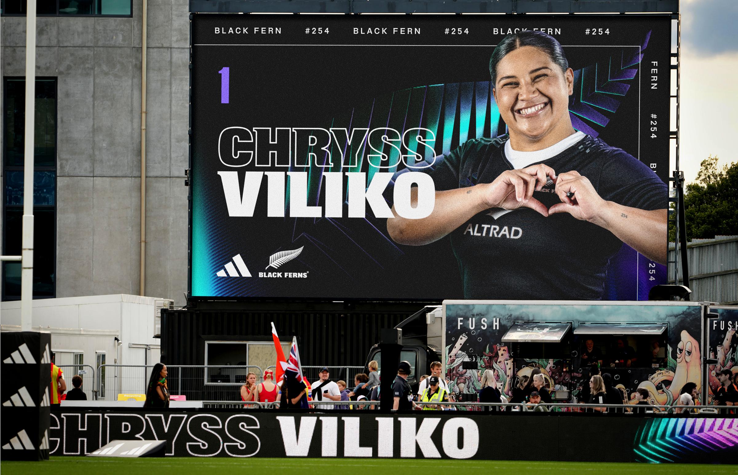
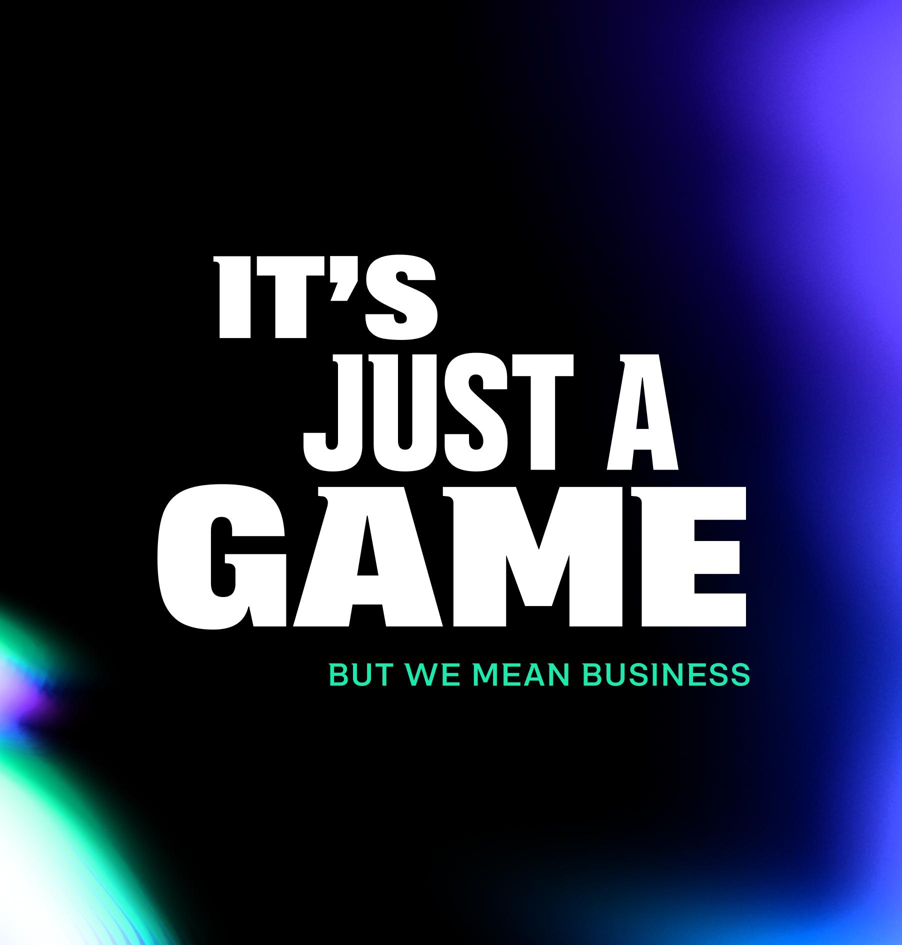
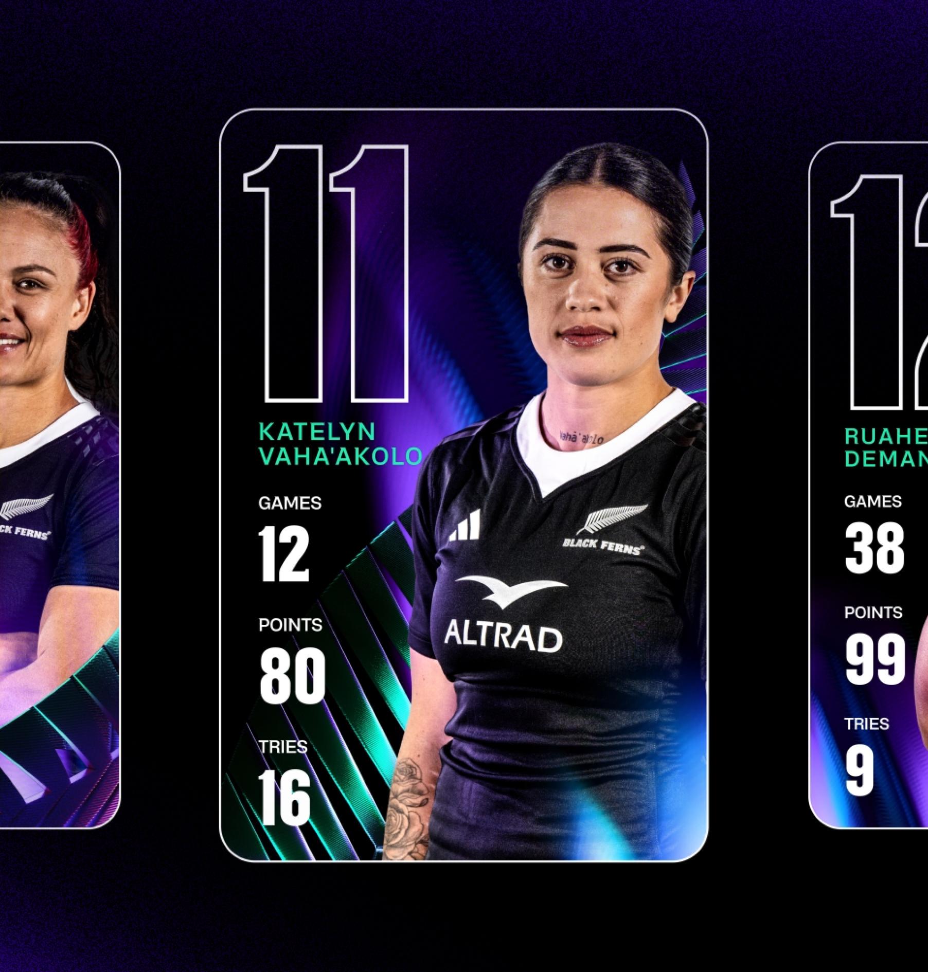
Black is instantly recognisable in sporting codes across New Zealand, and rugby is no different. Black has a mystery, just like our teams. But for black to have form, there needs to be light.
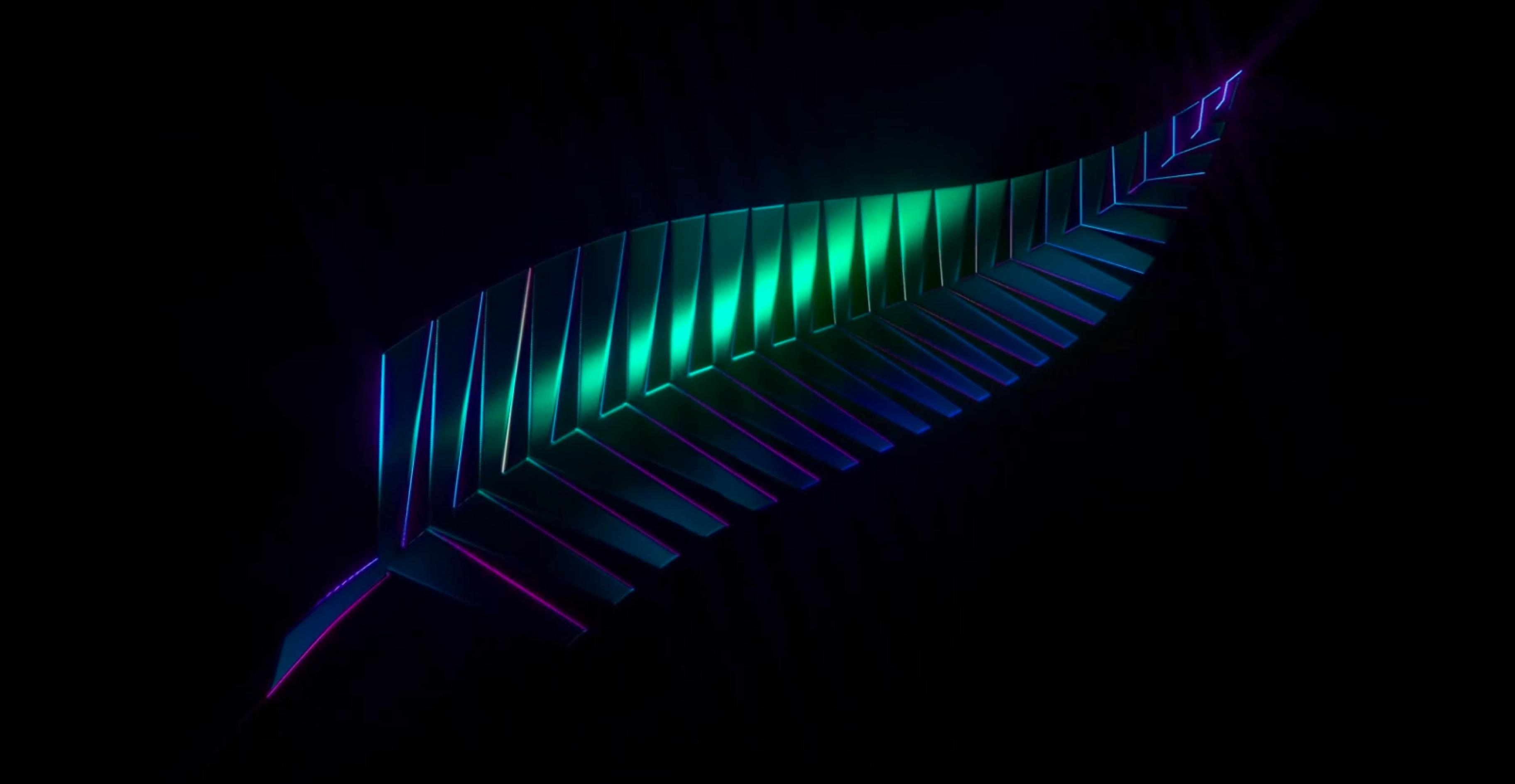
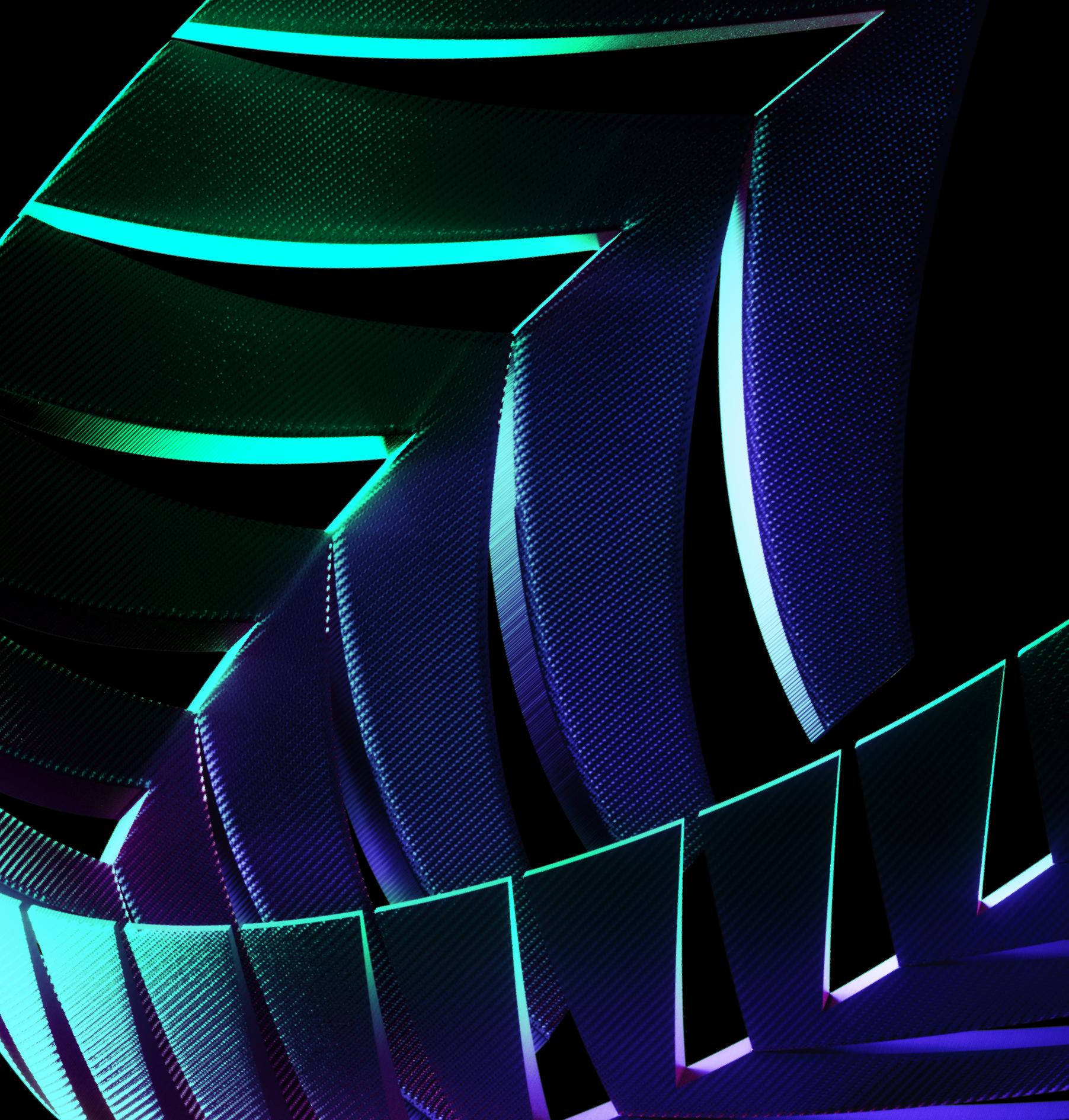
Keeping black as the core, we introduced secondary colours to add depth and dimension – green is for growth and renewal, evoking the abundant nature of New Zealand, and purple acts like stadium lights, illuminating the darkness.

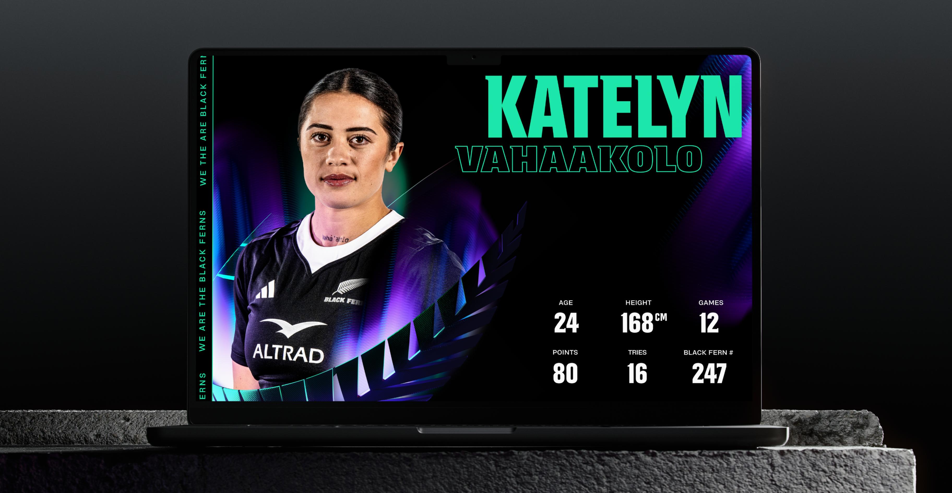
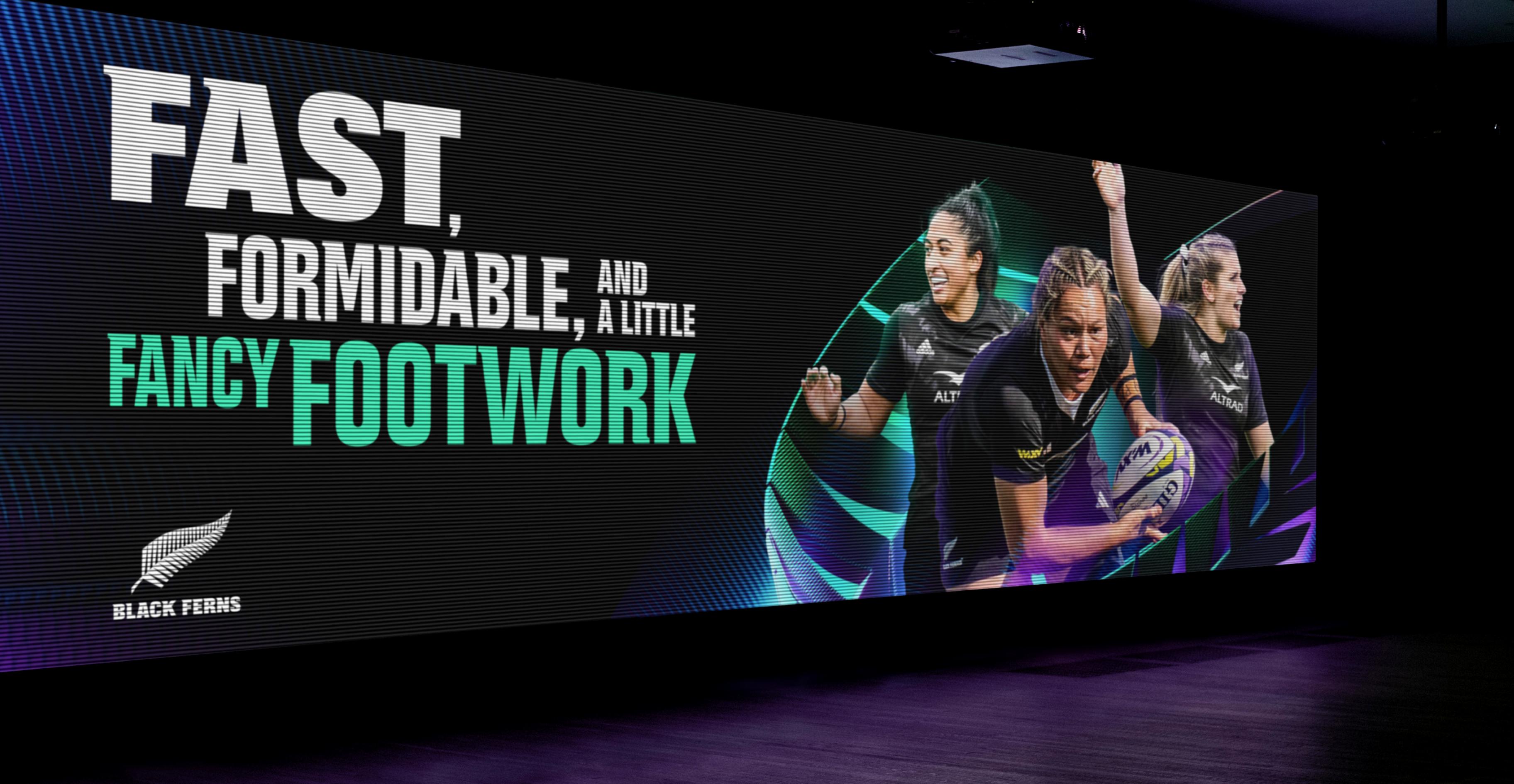
As they begin to turn up more and more in the same spaces as the men’s team, it was crucial for both the All Blacks and the Black Ferns to feel like they were on equal footing – while making sure they keep their own big personalities.
As a result, each team shares the same core design system, but they express themselves in different ways, allowing both brands to sit side-by-side while still capturing what makes them both so special.
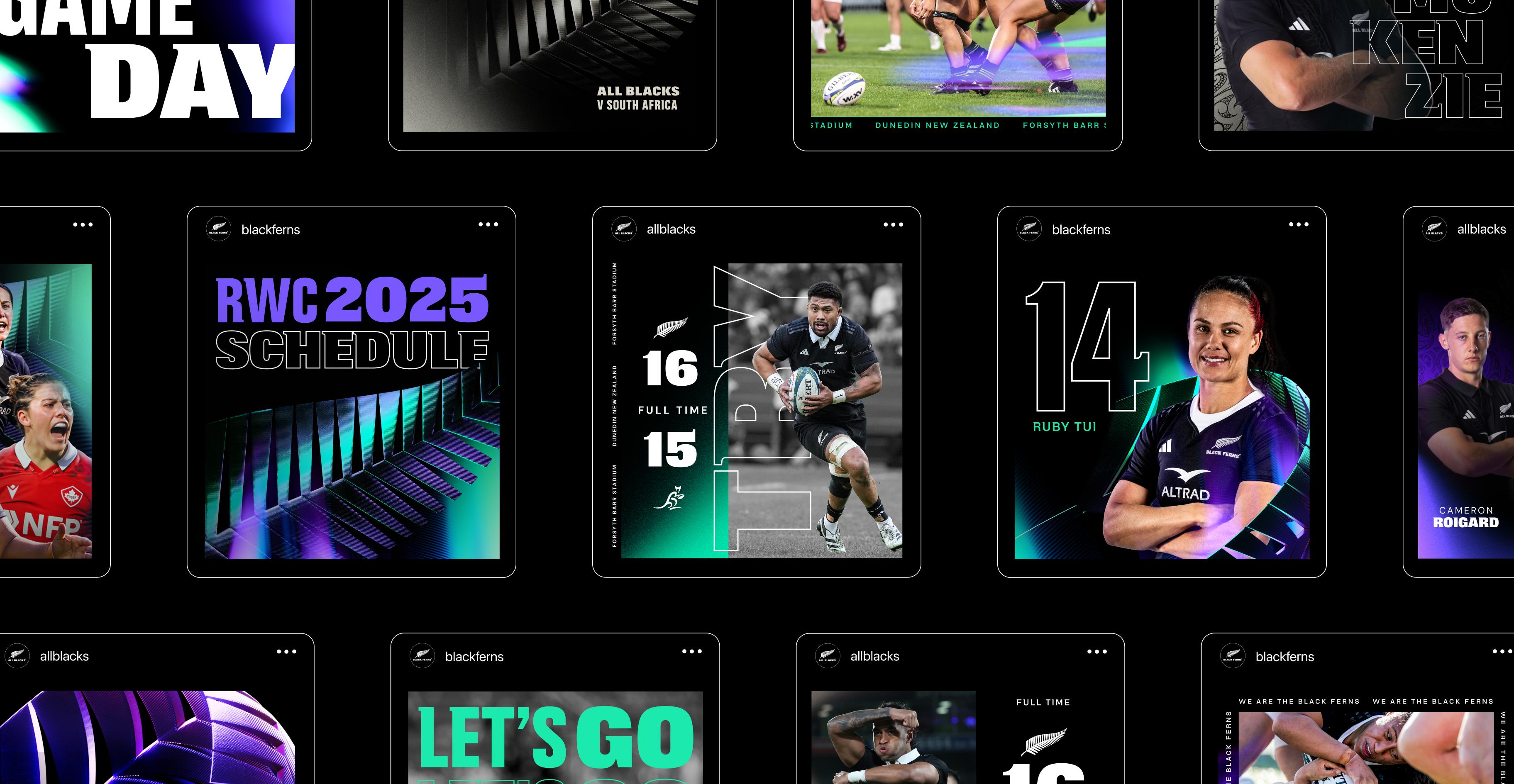

The brand now behaves as a statement of intent: women’s rugby is not a secondary story, it’s the future of the sport. How good is that?!