Medibank Group
Created connections for all Australians with the crew at Re and the wonderful team at Medibank Group.
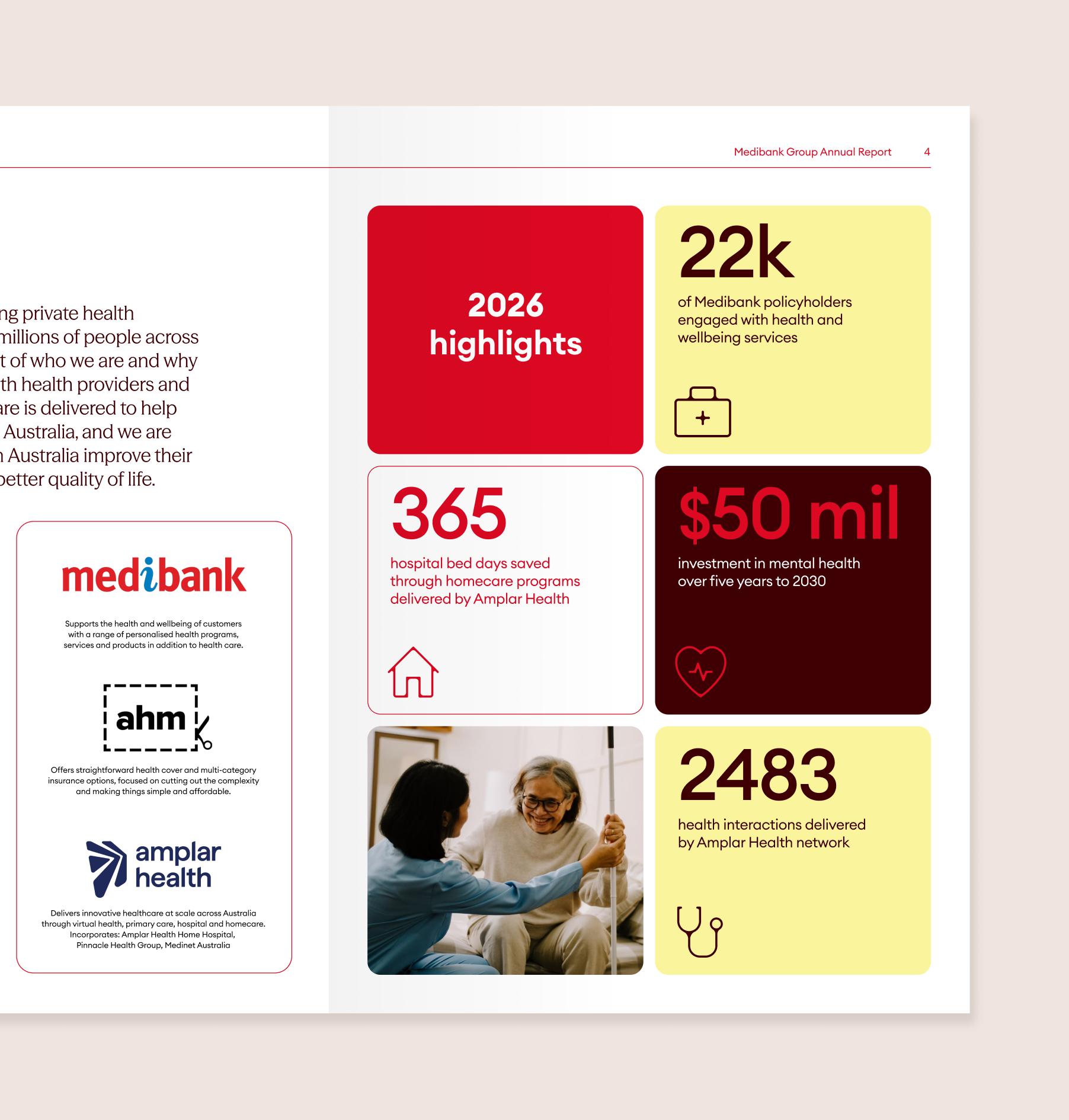
Sitting above Medibank, ahm and Amplar Health, Medibank Group needed a new group-level identity that clearly distinguished the organisation from its consumer brands.
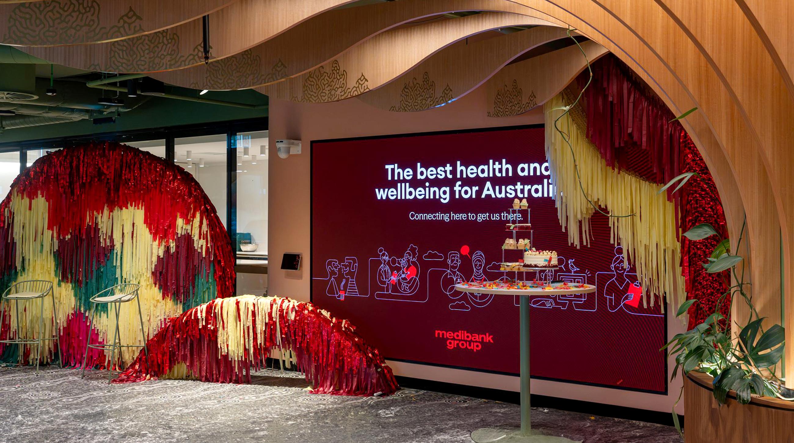
With services that stretch from primary care to home health, insurance to dental and physio, Medibank Group is in a unique position to enable seamless connection across all aspects of the health landscape, for all Australians. From our framing device to our illustrations and the way we layout type, this connection is at the core of the brand.

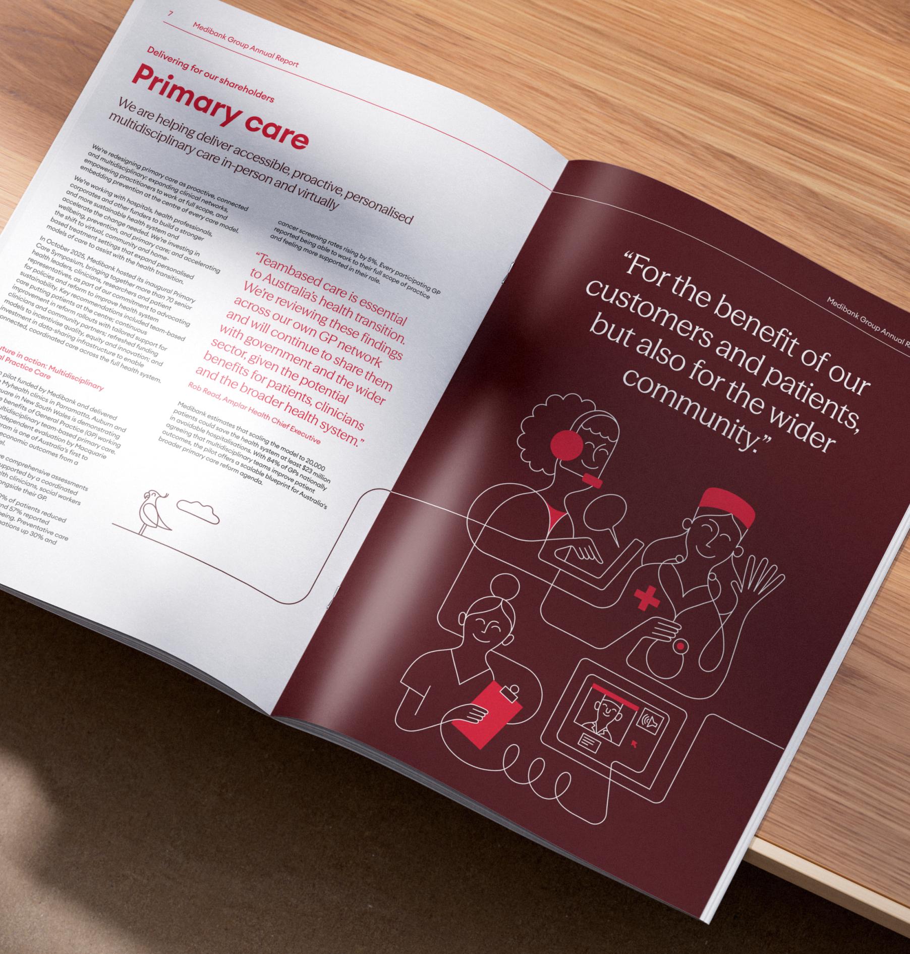
The logo is drawn from the brand’s 50-year history. A digital recreation of the original 1976 Medibank logo, it evokes the heritage of the Medibank brand while updating it for our new chapter – feeling balanced, confident, and ready to take Medibank Group into the future.
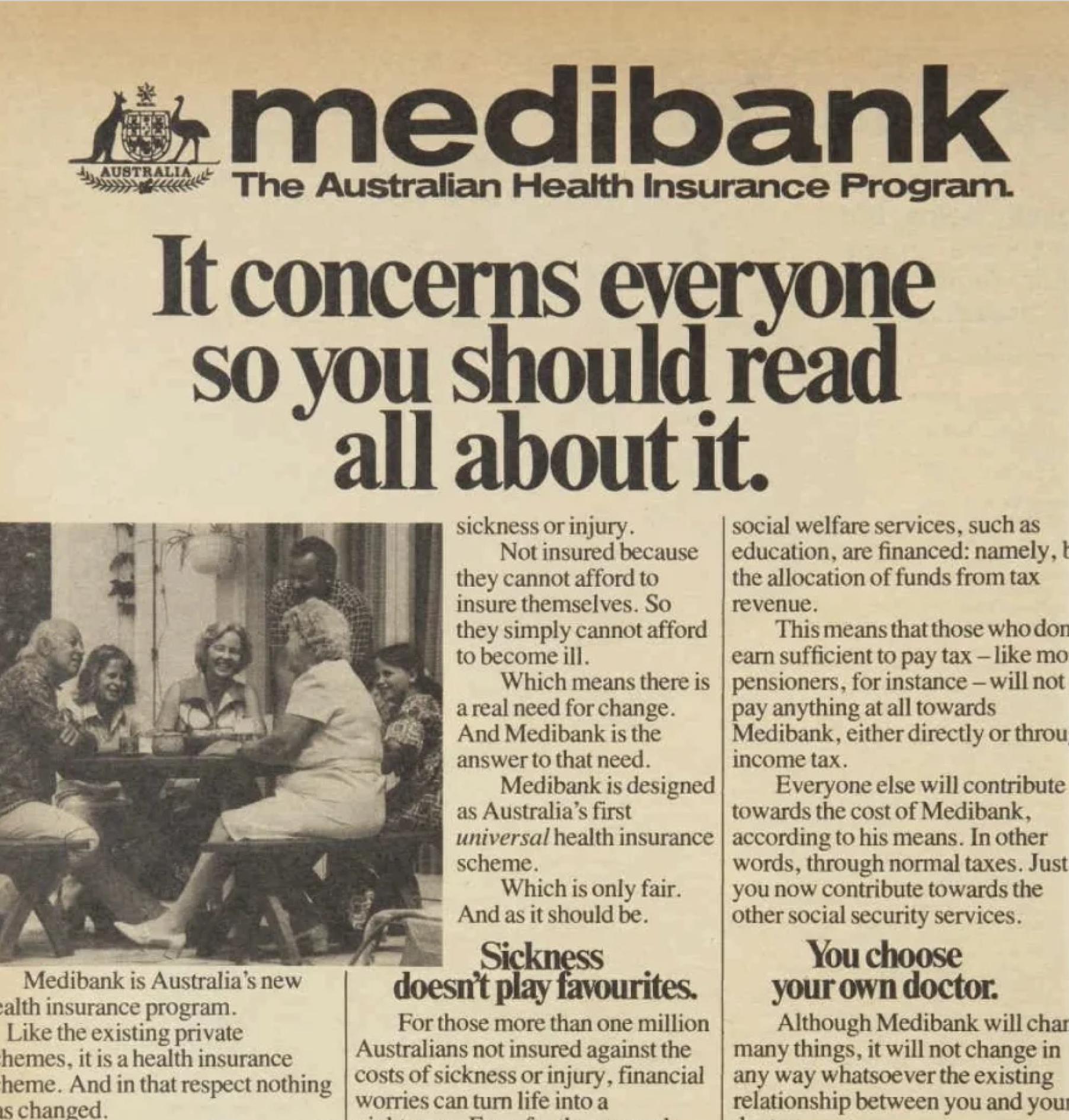

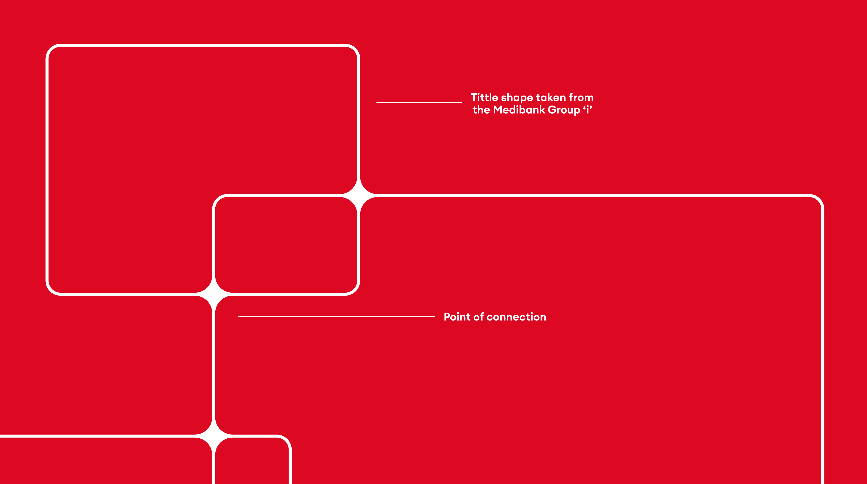
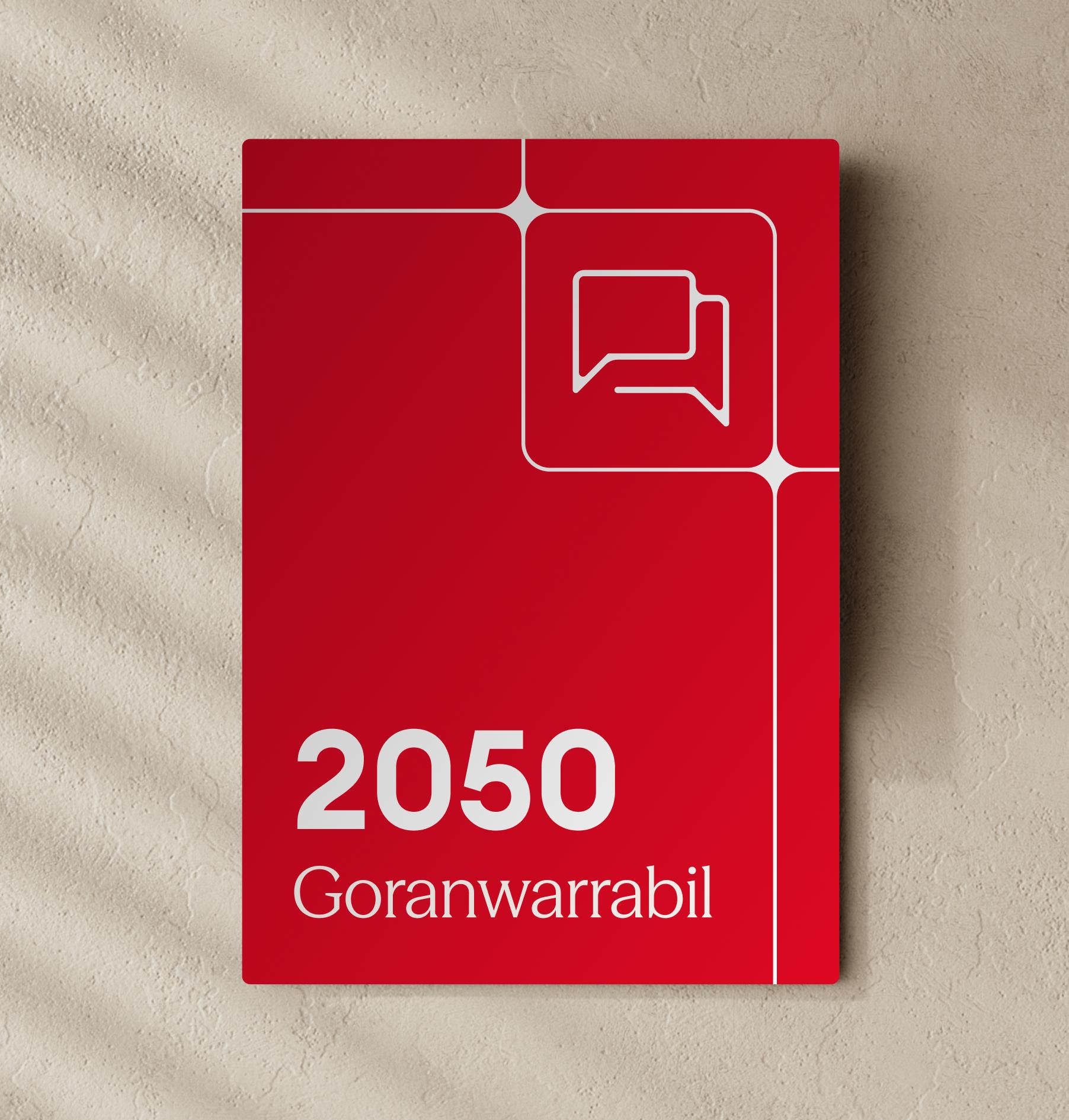
At the core of the graphic expression is the connection device. Stemming from the tittle in the Medibank Group logo, intersecting shapes come together to create moments of connection.
These points of intersection become a visual cue for the relationships, pathways and possibilities that connect people across the health landscape.
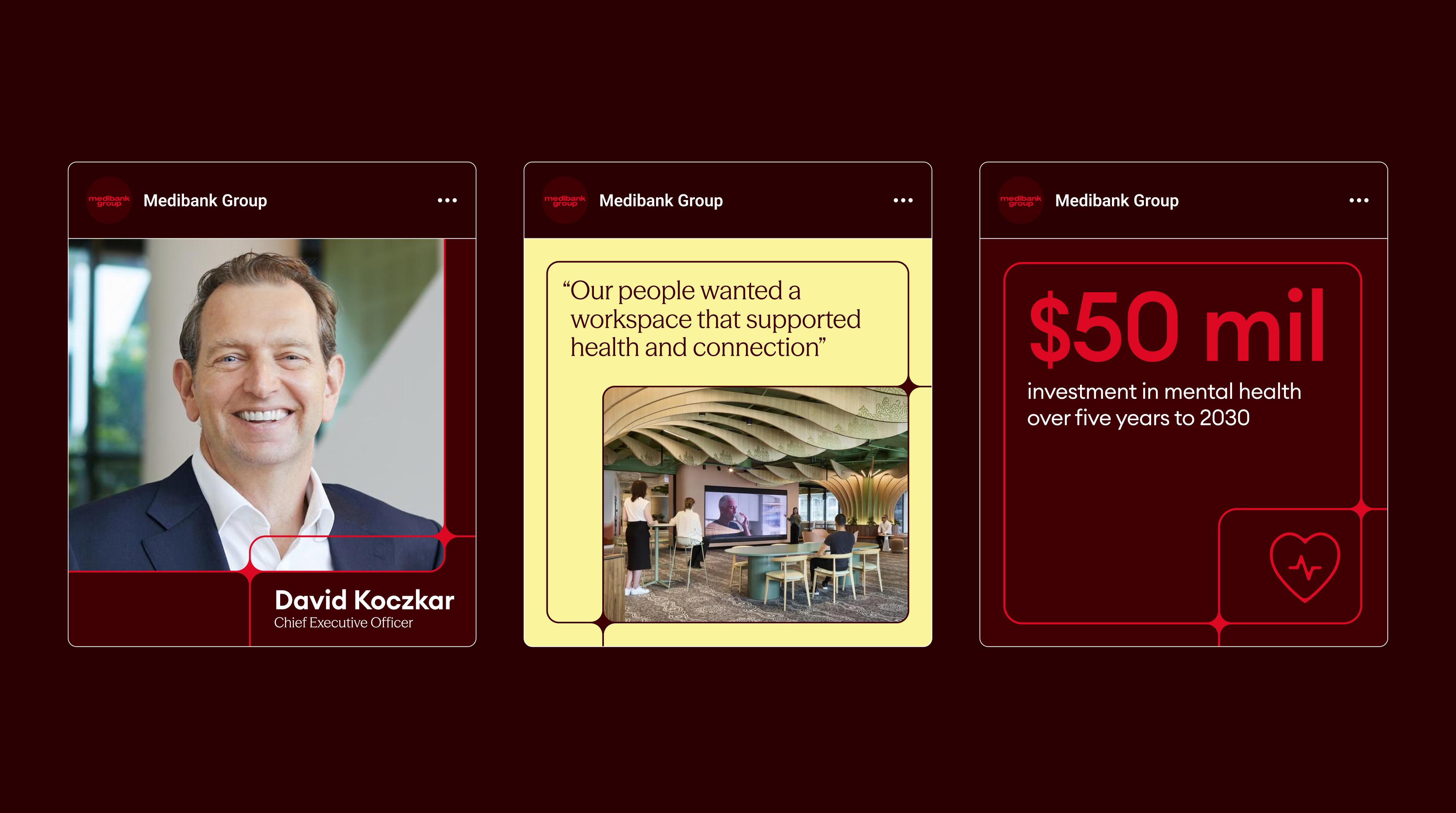

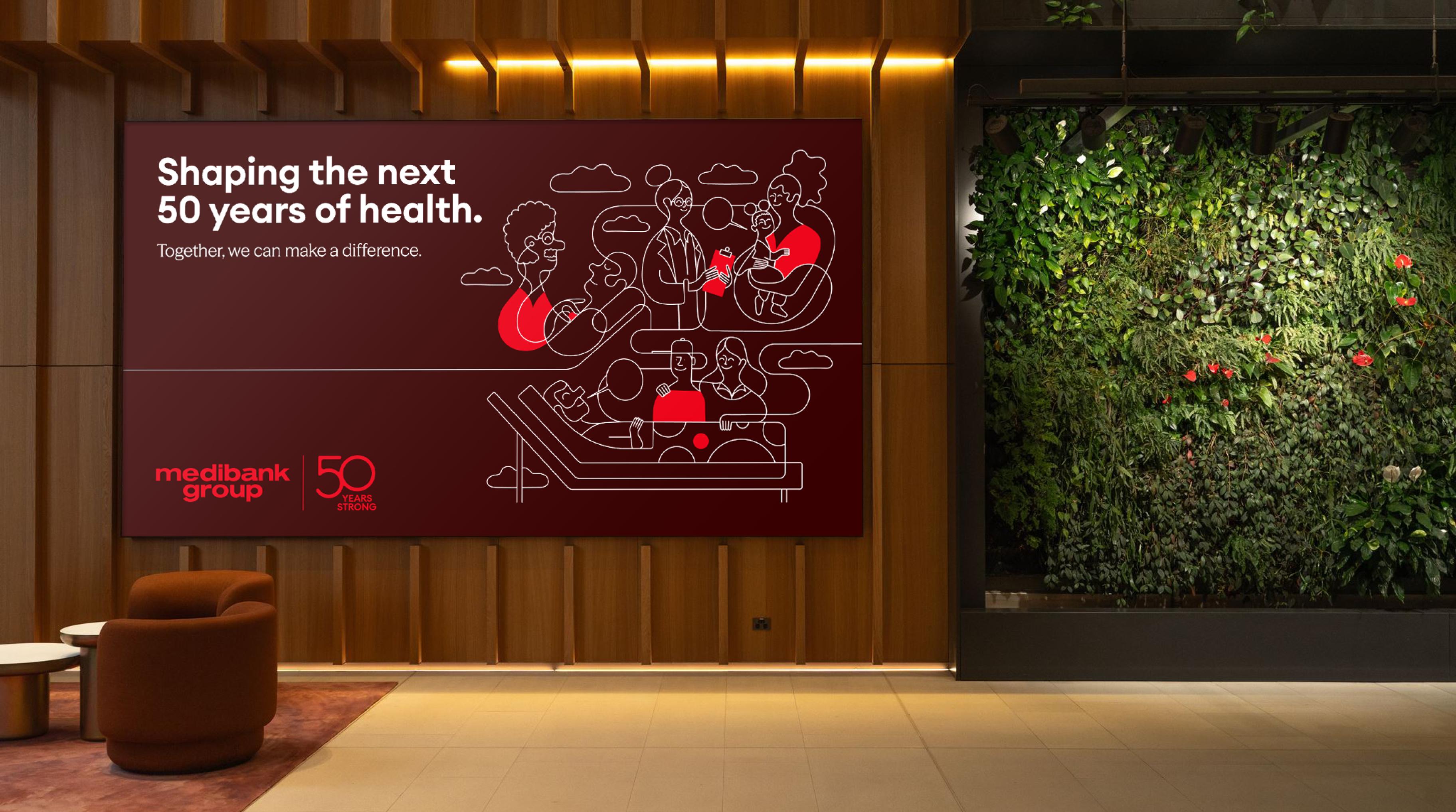
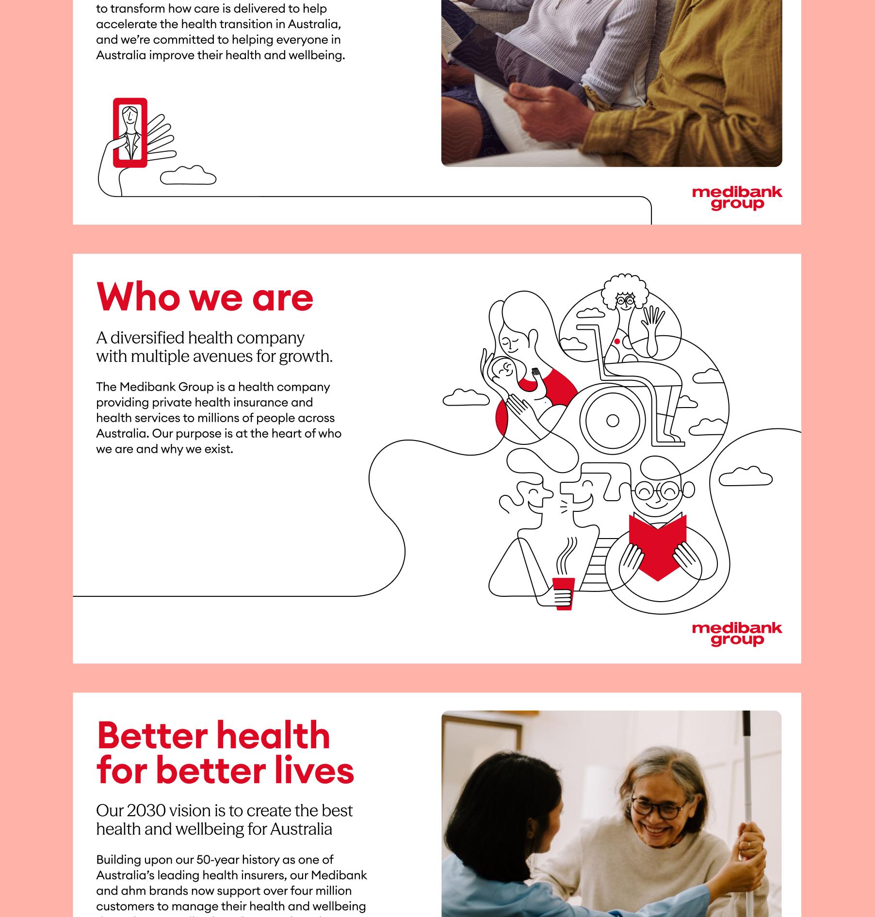
Connection is also at the heart of the illustration style, bringing Medibank Group’s role of connecting people to health to life in a simple, human and expressive way.
We collaborated with independent artist Jonathan Calugi to create a library of illustrations celebrating continuous line work, organic shapes and moments of interaction.



The new Medibank Group brand launched in celebration of their 50th anniversary, reflecting on where the brand has been and the role it continues to play in shaping the future of health in Australia.