The Aunties
Made with my design bestie and partner in purposeful troublemaking, Ika Jumali – plus a village of Aunties.
The Aunties is a volunteer support network born out of a desire to connect, champion and inspire women and marginalised genders in the advertising industry.
In 2025, Ika Jumali and I stepped into the role of Head Design Aunties and spearheaded an evolution of their visual identity.
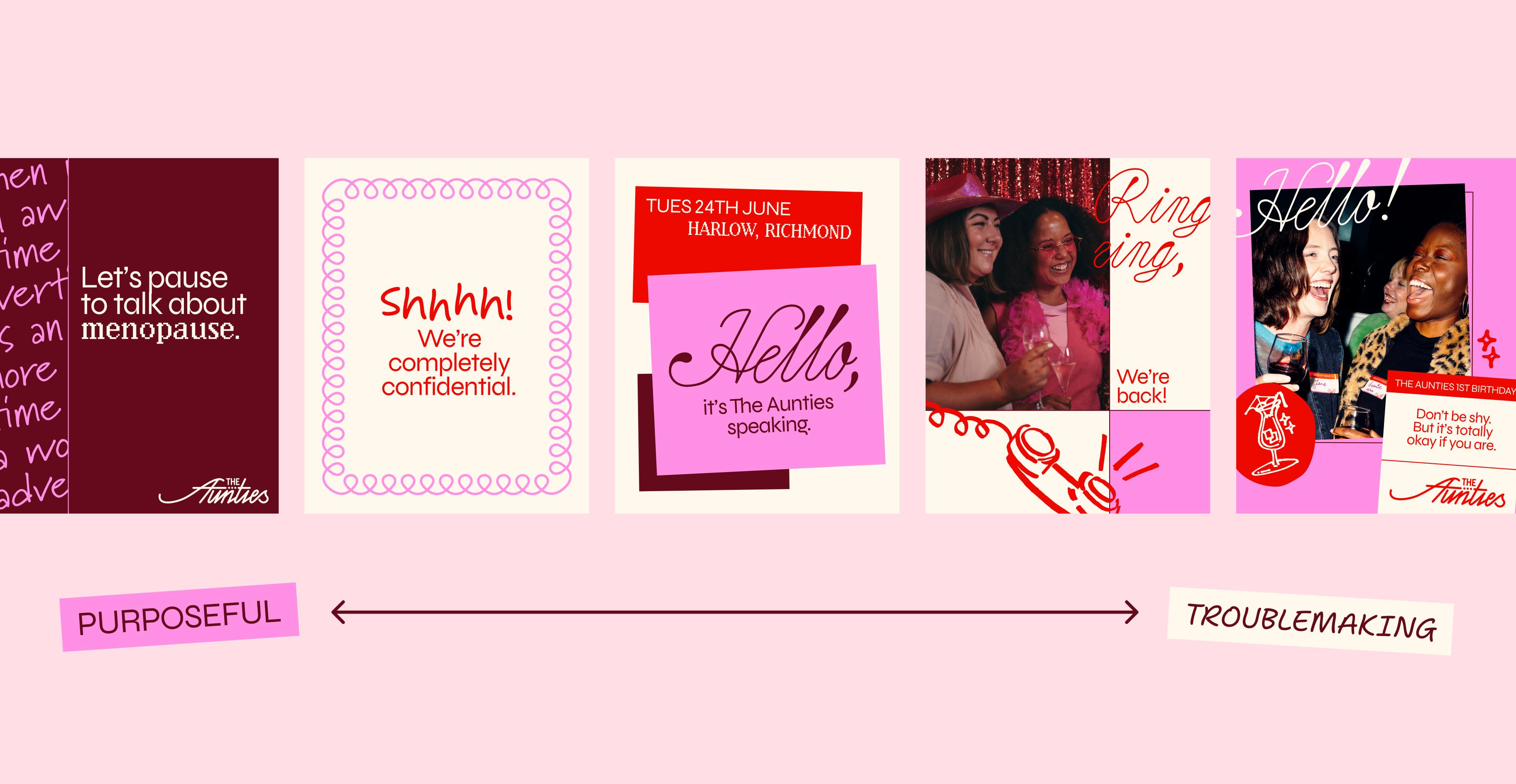
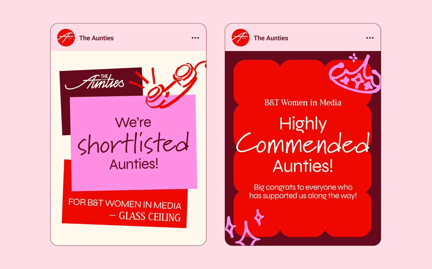
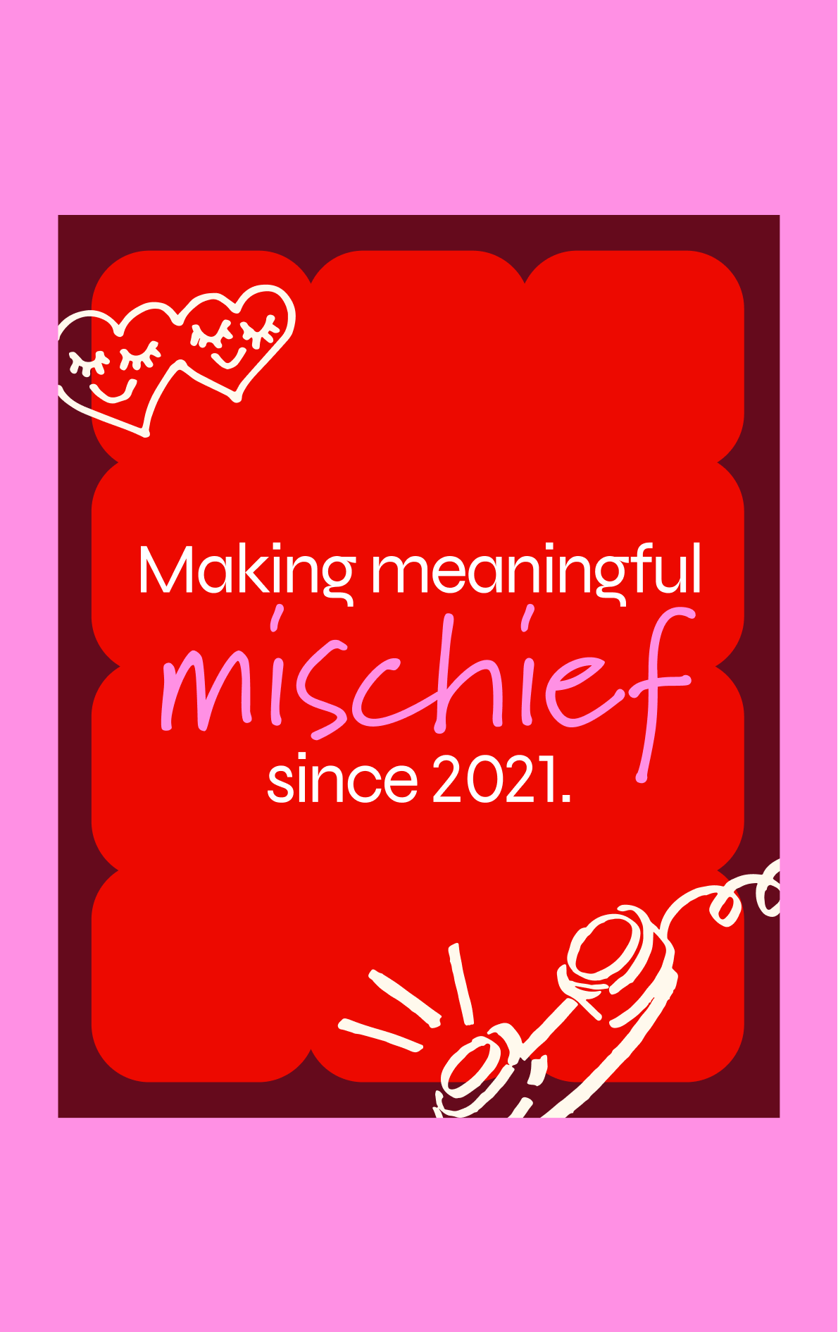
We knew that The Aunties’ brand was beloved (by us, namely), had strong recognition in the industry, and had become synonymous with connection, support, and progress. So we focused on retaining what was unmistakably Aunties – the pink and red, the iconic rotary phone, the tone of voice – and pushing the rest of the brand into a space that more strongly aligned with the strategic positioning of Purposeful Troublemaking.
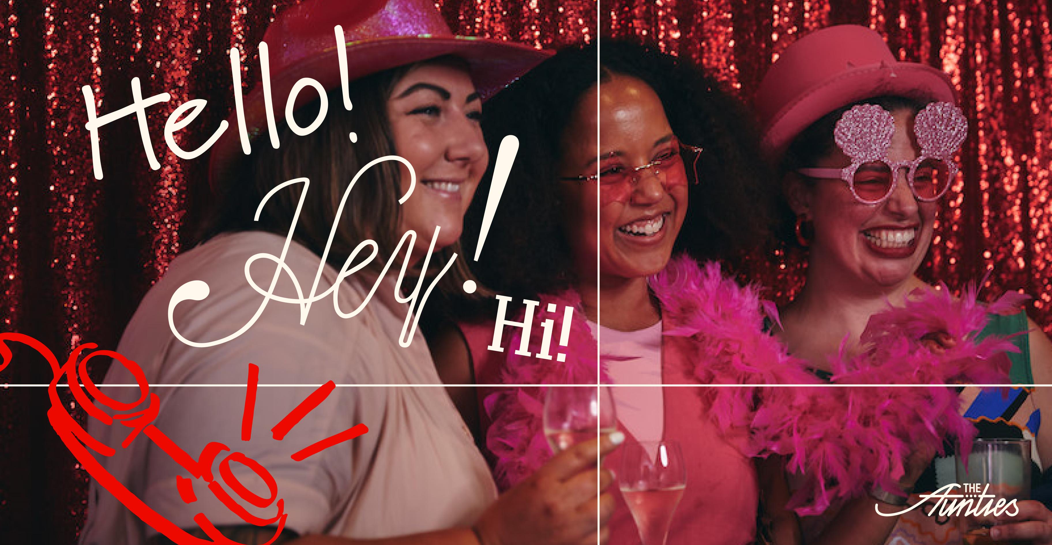
The Aunties’ brand prop – Purposeful Troublemaking – became the design idea and two ends of a flex spectrum. The brand visually moves between being more purposeful (gridded, utilitarian, useful) to more troublemaking (organic, textured, playful).
The Aunties is the epitome of being created by the community, for the community. So we wanted the brand to be the same.
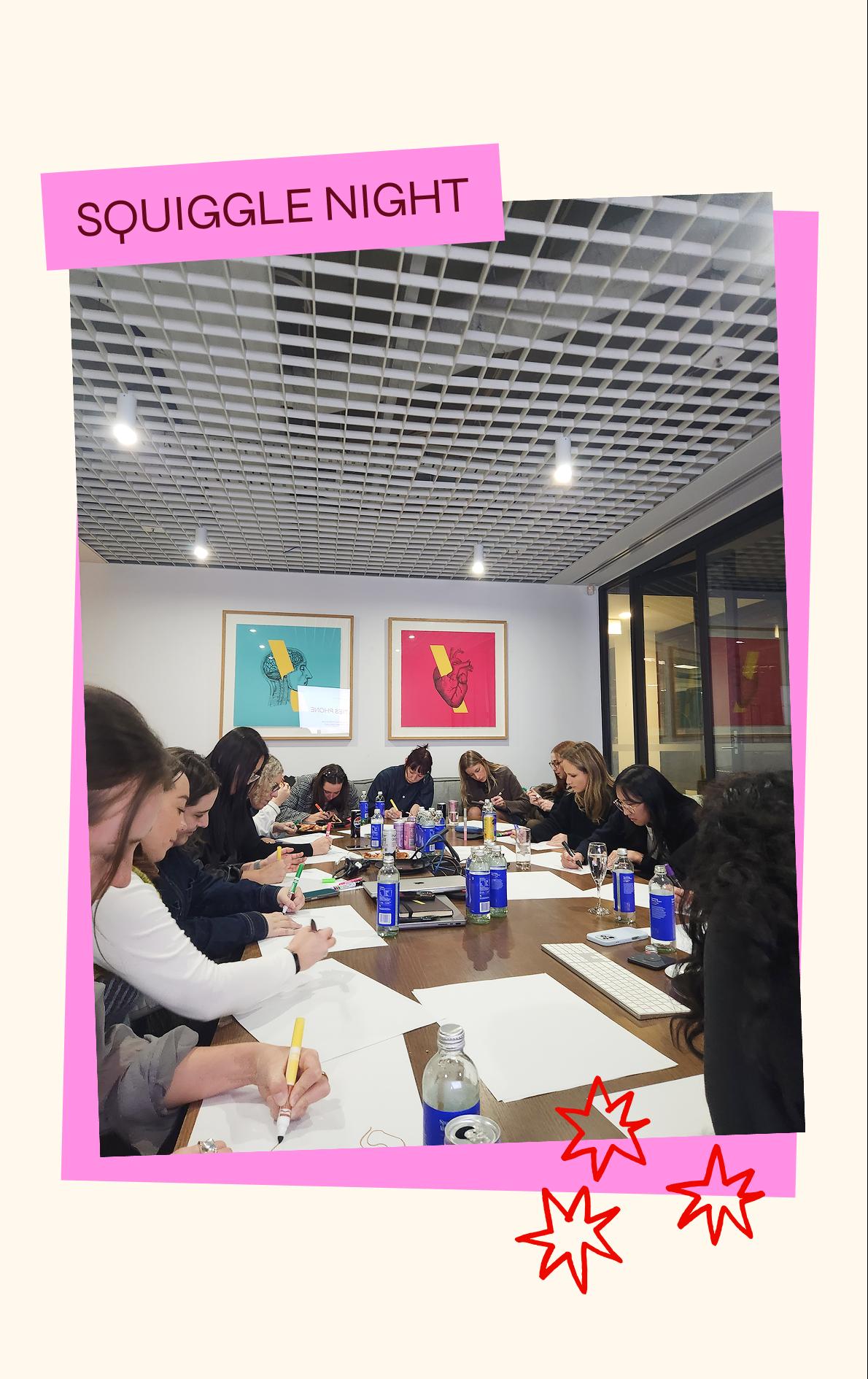
We gathered a group of kind, creative ladies around a table one evening and got them to draw what came to mind when they thought of – community, advertising, parenthood.
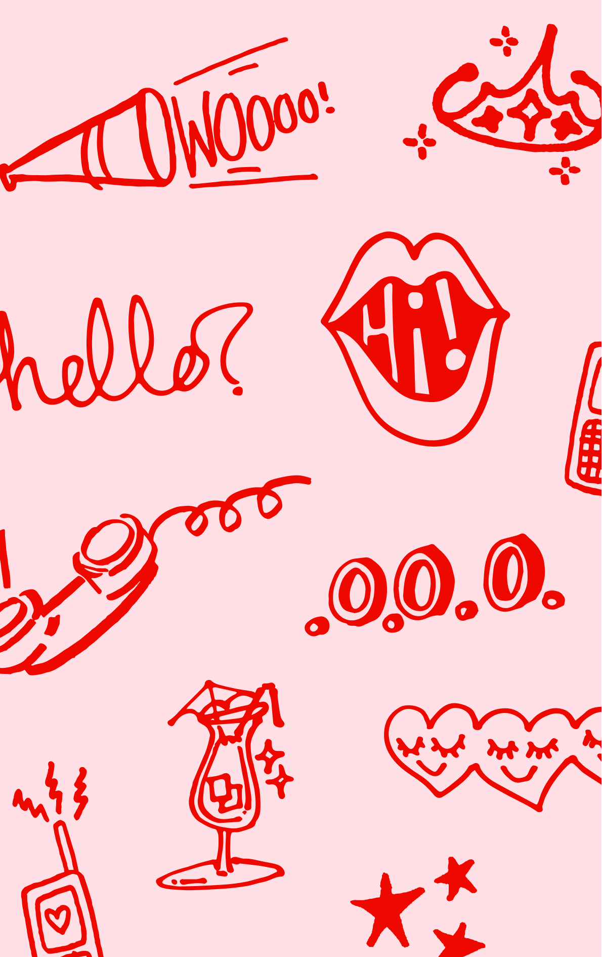
These squiggles became a core part of the visual identity – reflecting the unique personalities that make up our community.
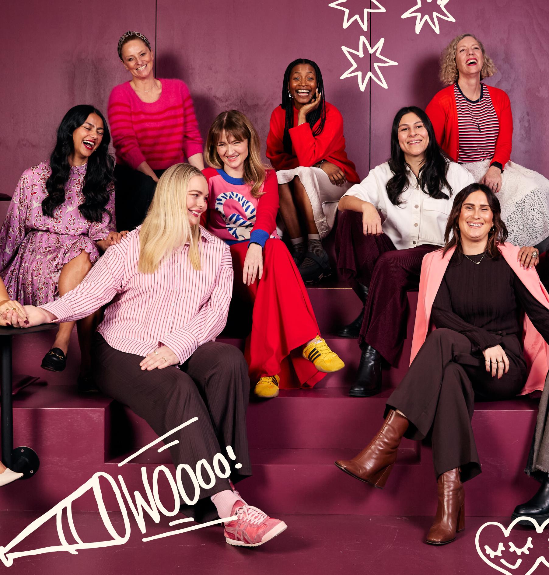
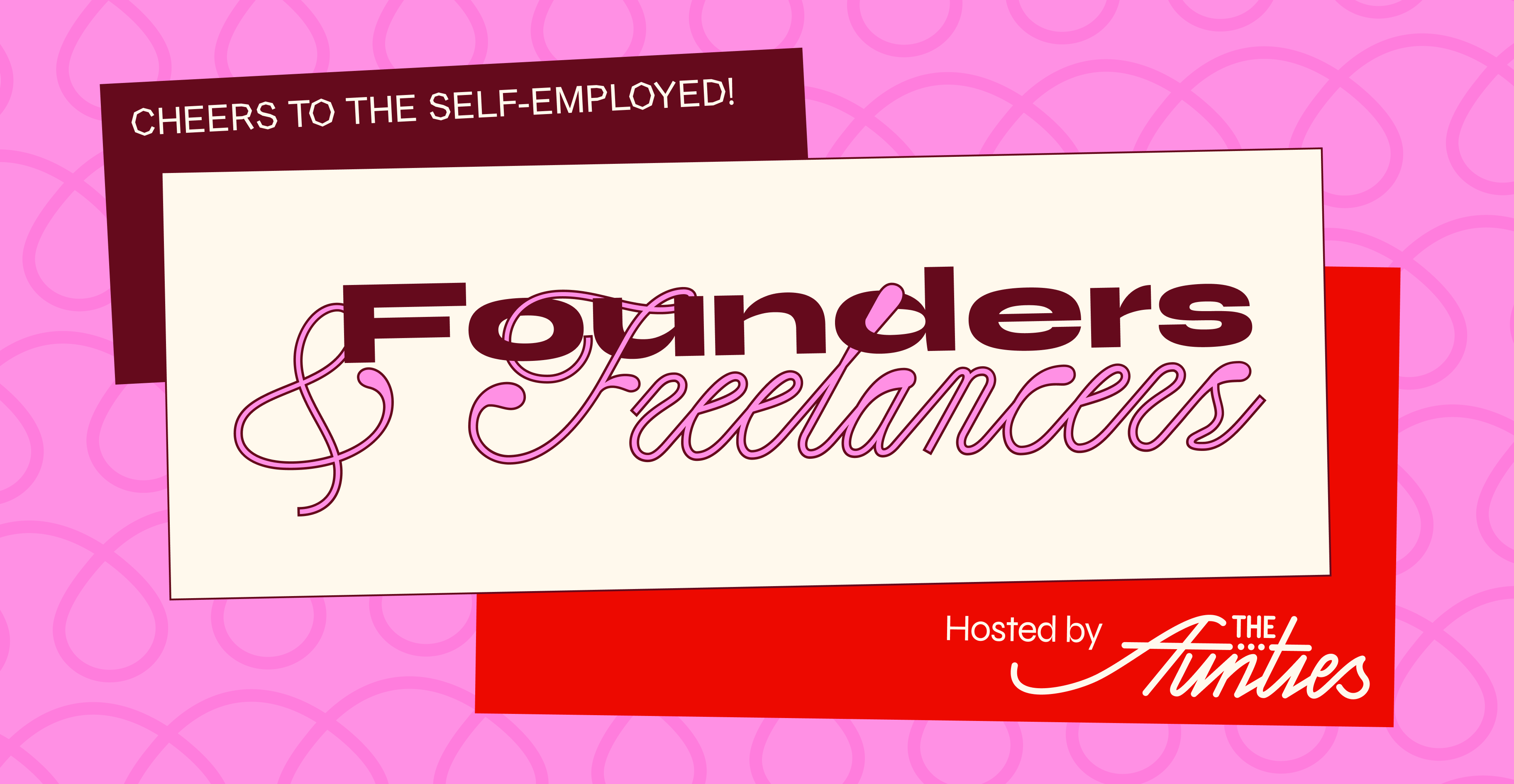
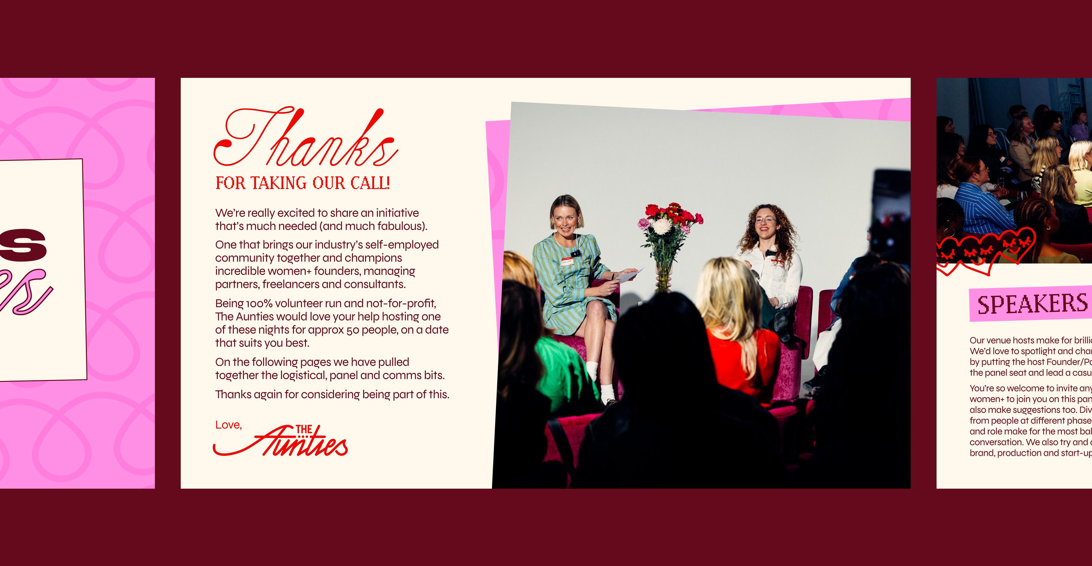
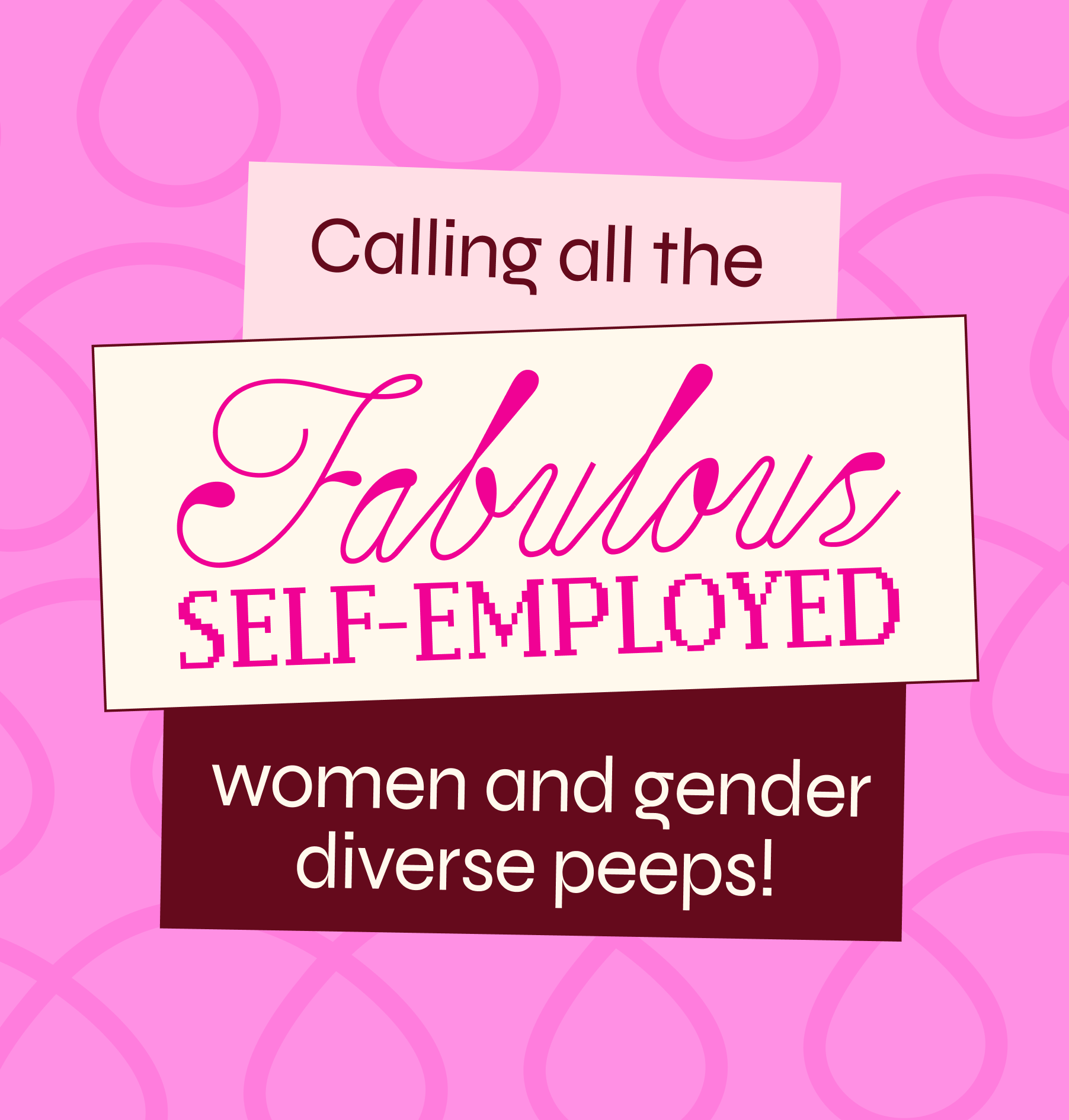
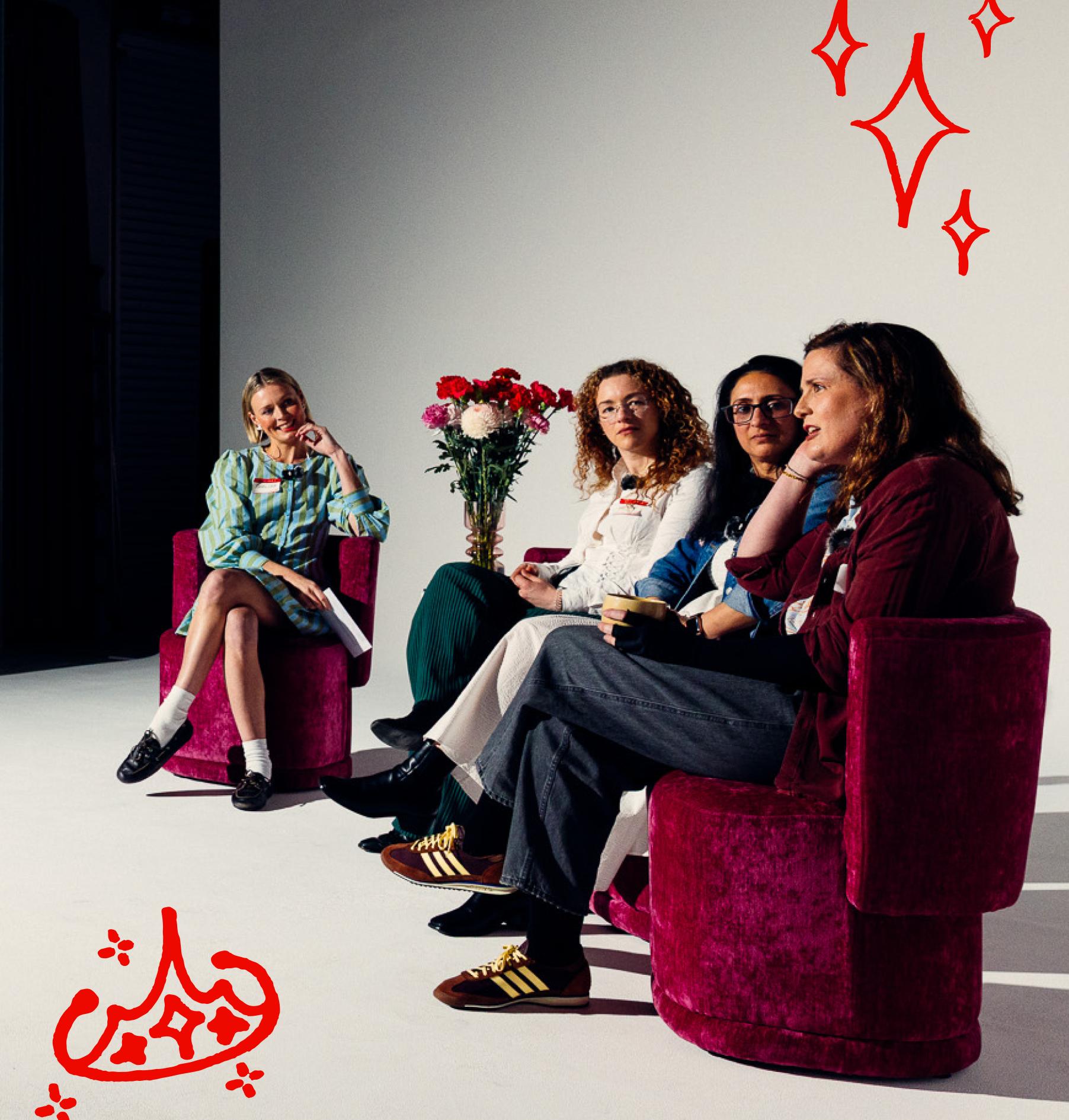
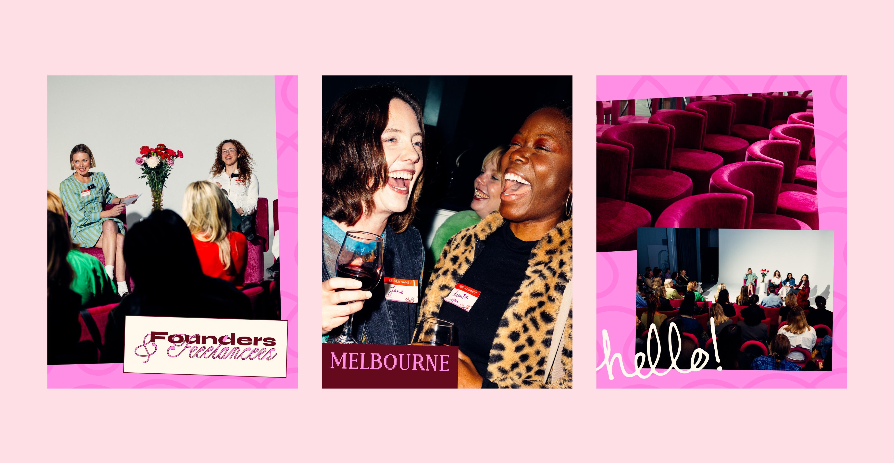
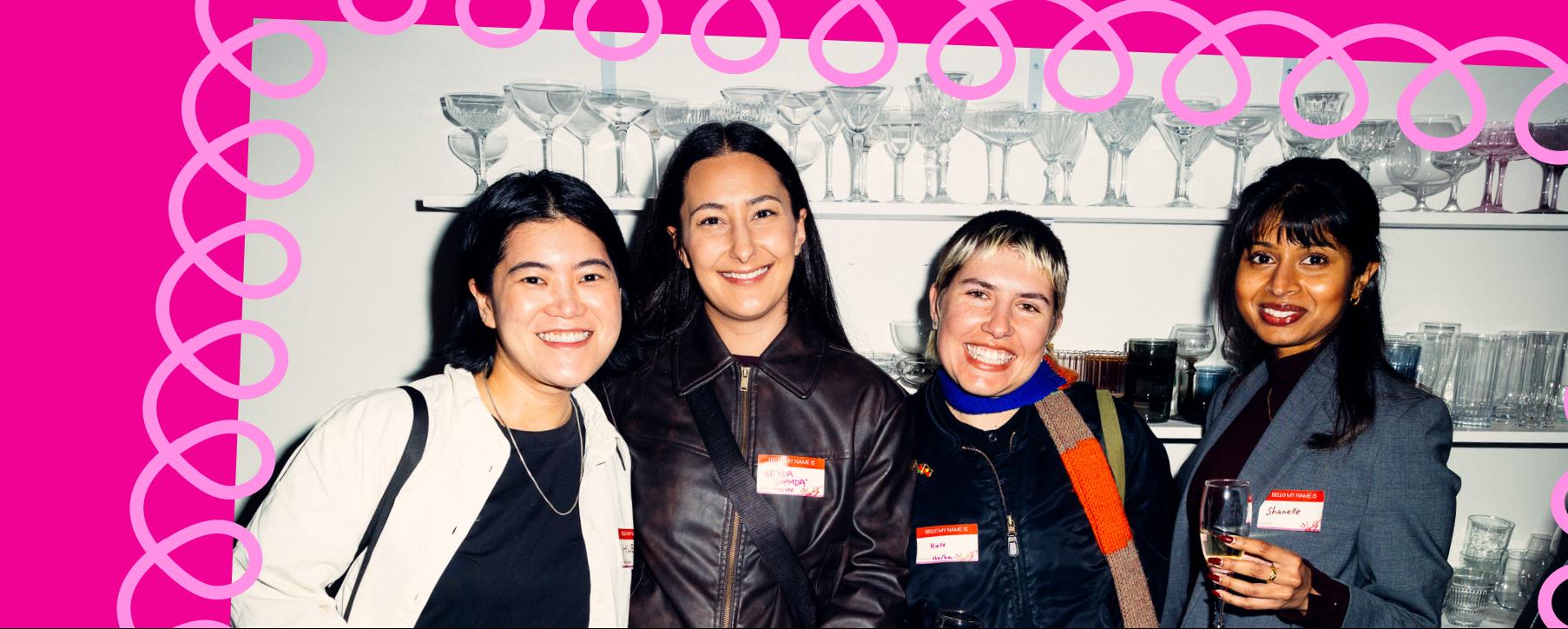
The first big test of the stretch of our evolved identity was a new Aunties initiative – Founders & Freelancers.
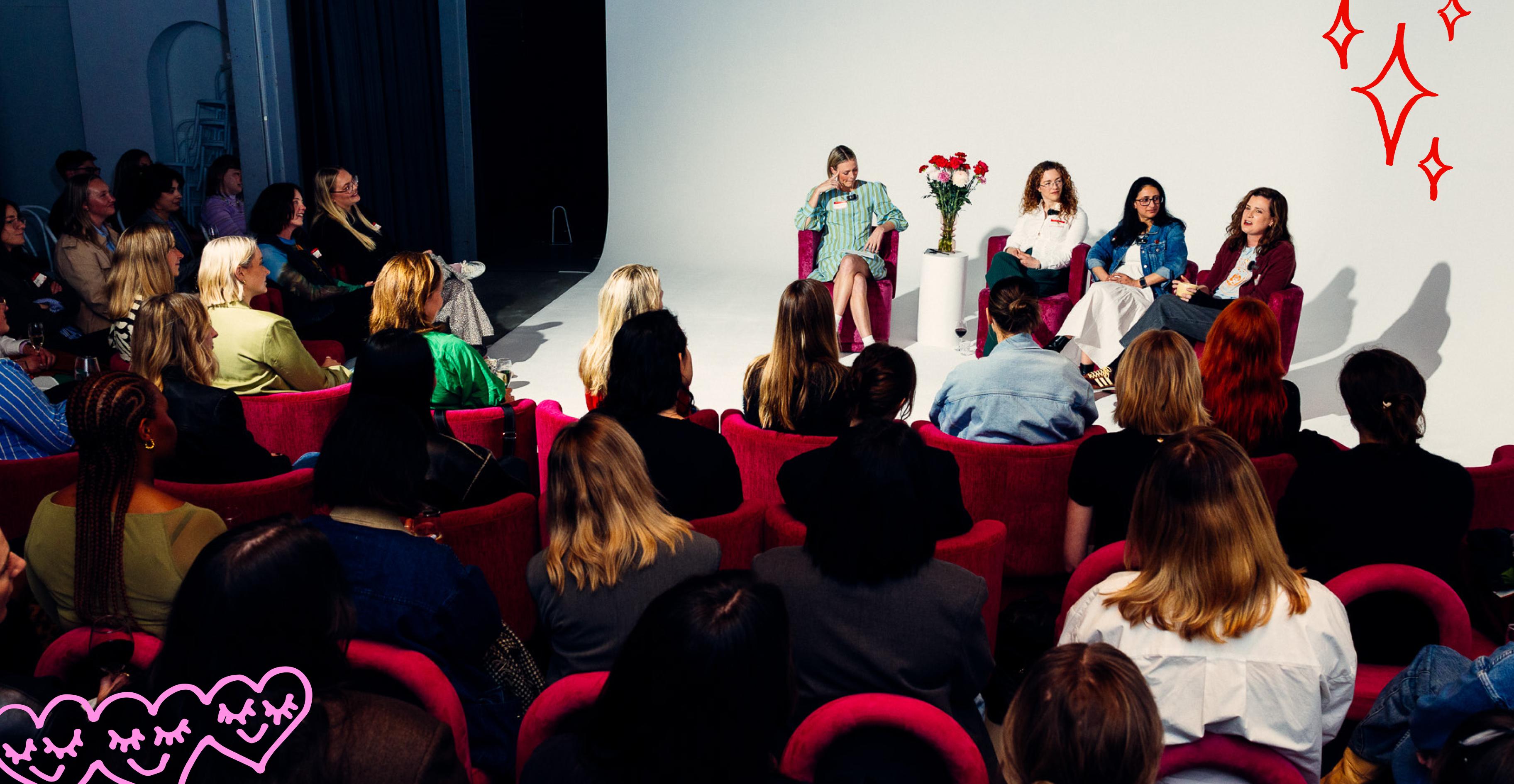
An event bringing our industry’s self-employed community together and championing women founders, managing partners, freelancers and consultants.